Tuesday, October 23, 2018

Now TV pretty ugly animation


For this animation video I used the second Pretty ugly Now TV design I created and imported it into Photoshop. I opened the Timeline window and started to create a frame animation using large circles appearing one at a time, getting bigger and using a different ugly, bright colour. on the second frame I used the colour halftone effect on the circle and added a black circle under the first circle. I planned to zoom into this black circle once all the other circles had come up. However I realised it would be incredibly difficult to do this technique on Photoshop as I would need to gradually expand the image in each frame. Because of this problem I decided to export the Photoshop video and import it into Adobe After Effects. Once i had done this i dragged the video into the editing section and duplicated it. I cut the first layer to where the circles stop appearing then on the other layer. I enabled position and scale and I made a frame with the same size image as the previous then another with the image fully expanded and moved into the black circle. This made it so the camera appears to be zooming into the black. Then I imported the Now TV logo and did a similar process so that it expands towards the camera. 


Now TV Animation


Tuesday, October 16, 2018

Now tv Pretty Ugly


These are my two Now TV designs I created in the "Pretty Ugly" style. I think these designs reflect this style perfectly. I used garish, clashing colours to make it an eyesore. I used ugly effects on photoshop such as mezzotint and postalise on the pixelate option. I used colour halftone a lot to create a dotted texture in both backgrounds, this made these designs more interesting and I think it suits the pretty ugly style.
To make my designs more "pretty ugly" I could have used a more unorthodox composition with the letters. I decided against this because I felt it would ruin the aesthetic of the piece and instead I used echo letters in the background that were more randomly placed.

Pretty Ugly Design


Pretty ugly design strifes to defy the Swiss Style rulebook and embrace an increasingly more daring aesthetic and geometric arrangements, avoiding crisp white space and lowercase type in favour of vibrant gradients and unstructured, purposely bad composition.
I don't particularly like the Pretty ugly style because I find it very visually unappealing and I don't like the randomly placed images. I managed to find examples of designs that I can appreciate above. I like the use of font in these examples and I particularly like the colour scheme in the third piece. The colours are vibrant and garish but they work well together and give off an interesting vibe.
I will create my own take on the style leaning towards a more composed approach.

Tuesday, October 9, 2018

Helvetica Swiss Style Movie Poster


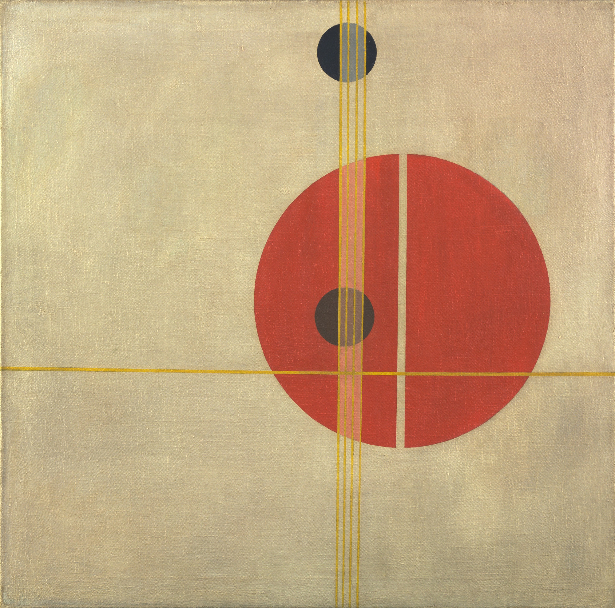
I created these posters as an advertisement for the Helvetica documentary film. I used helvetica font and a clean, abstract design in the background. For the background I incorporated elements of Bauhaus into the design.
The first poster was the original that I used as a basis for all the others. With each one I adjusted the colour scheme, arranged the objects and fonts differently and added or removed other shapes, mainly circles. 
To reflect the Swiss design style I used a minimal colour pallet, sans serif "Helvetica" font, and large areas of dead space on the right hand side.
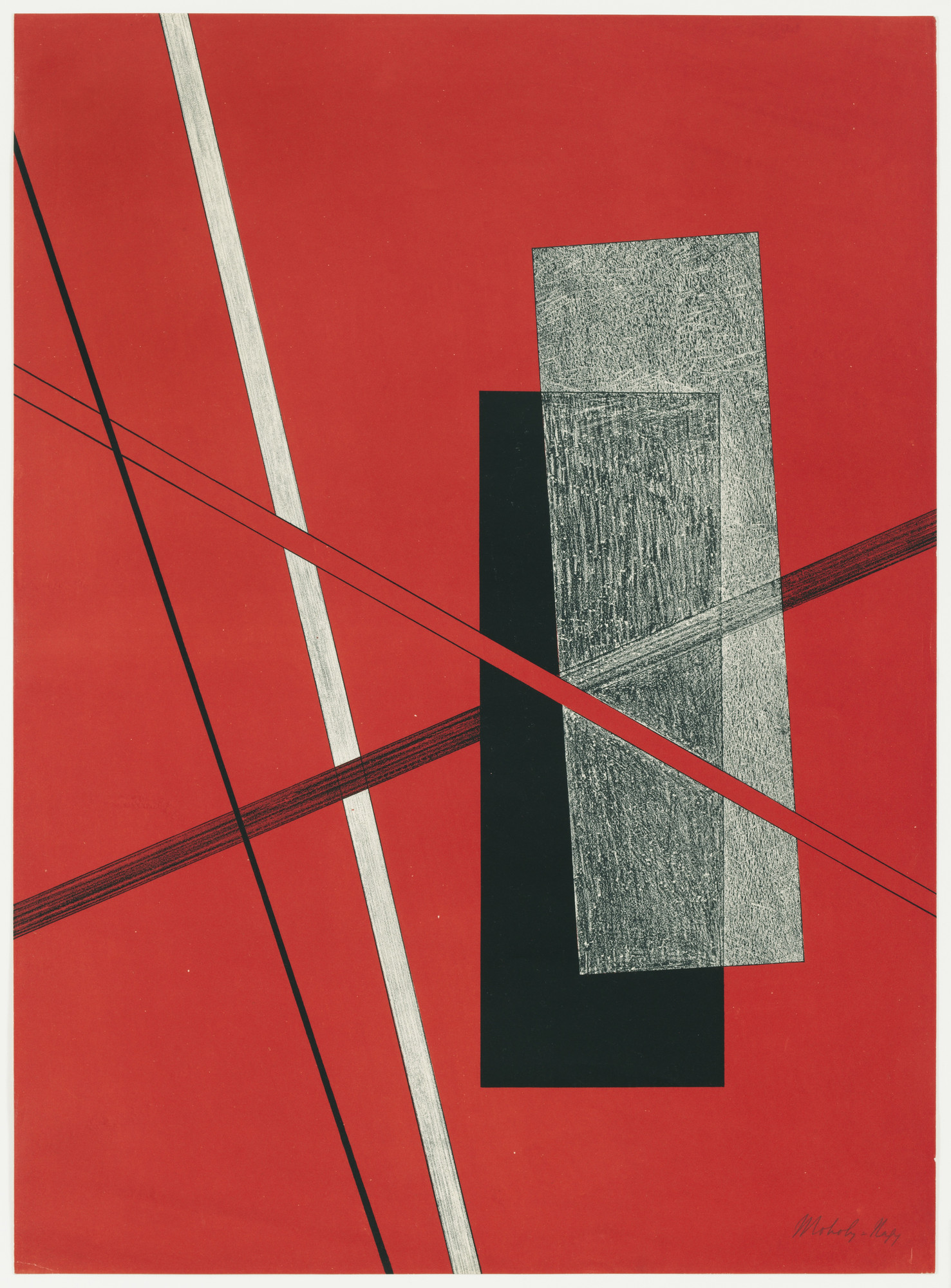
I used the transparency tool to create shadow effects that gave the posters depth. I really like the effect this creates as the main tittle appears to come out at you while the design sinks back and appears like a flat image with writing floating in front, this technique is more effective in some variations than others.


This is my favourite variation of the poster as I feel it has the best composition and colour scheme. The red being the predominant colour makes this an incredibly vivid piece that could catch attention from a mile away, this is a valuable aspect for a movie poster to have. The red also compliments the black and the grey really well.
I like the design of the black circle coming out of the H in Helvetica and how the smaller circle looks like a shadow being cast upon the background, making the title really come forward. This poster is the best example of this.

One thing I could change about these posters is to make the lettering lowercase so that it conforms more to the Swiss design style.
 

Monday, October 8, 2018

Swiss design


The Swiss Style, is a graphic design style that emerged in Russia, the Netherlands, and Germany in the 1920s and was developed by designers in Switzerland during the 1950s. Swiss design has had profound influence on graphic design as a part of the modernist movement, impacting many design-related fields including architecture and art. It emphasises cleanness, readability, and objectivity. Hallmarks of the style are asymmetric layouts, use of a grid, and sans-serif fonts like helvetica.

The Swiss style has influenced me to take a more simplistic, abstract approach to my art and incorporate typography into the design. 

Friday, October 5, 2018

Bauhaus


Bauhaus, literally translated to “construction house”, originated as a German school of arts in the early 20th century. Founded by Walter Gropius, the school eventually morphed into its own modern art movement characterized by its unique approach to architecture and design. Today, Bauhaus is renowned for both its unique aesthetic that inventively combines the fine arts with arts and crafts.
Bauhaus art is usually abstract  or uses simple shapes  put together stylishly to resemble something. Most of the art and designs are limited to primary colours and use very precise, carefully composed lines and curves.
László Moholy-Nagy
Image result for László Moholy-Nagy   Image result for László Moholy-Nagy
 Wassily Kandinsky
Image result for Wassily KandinskyRelated image
I like the minimal style of Moholy-Nagy compared to Kandinsky who's work I feel is too crowded, with a lot of different colours but with a dull white background.
I do like how Kandinsky's work appears to have depth even though the art is abstract and only features thin lines and circles. 
Moholy-Nagy's art is more inspirational for me, the simplicity makes the work look stylish and crisp. I will employ elements of  Moholy-Nagy's art into my own work. For instance I like the use of shadow effects in the second piece and the bright red colour. 
I have noticed that a lot of Bauhaus work doesn't use symmetry and the main subject is usually off centre and a lot of empty space is left in one corner.  


Feed magazine spread


I was commissioned to create a piece of art that carries the theme of death in the style of Dadaism for a magazine spread.


I took inspiration from the handmade, collage style that Dada art uses and I created a collage from ripped material, textured wallpaper, tape and cut out grids. I scanned this collage in and manipulated it on photoshop using the gradient map feature to change the colours. I decided to use a rusty orange-brown colour scheme that I feel represents the Dada style well. I added a blue to the gradient map to bring some contrasting colour to the piece. I collected a range of images that could represent the theme death but I wanted them to look like old illustrations. I thought of skeletal and anatomical diagrams and medieval depictions of the Grim Reaper.


Tuesday, October 2, 2018

Dadaism


Dadaism or Dada was an art movement of the early 20th century, with early centers in Zürich, Switzerland. Dadaism was a form of artistic anarchy born out of disgust for the social, political and cultural values of the time. It embraced elements of art, music, poetry, theatre, dance and politics. Dada was not so much a style of art like Cubism or Fauvism, it was more a protest movement with an anti-establishment manifesto. The Dada movement consisted of artists who rejected the logic, reason, and aestheticism of the modern capitalist society, instead they expressed nonsense, irrationality, and anti-bourgeois protests in their works.

I enjoy the style of DaDaism because it expresses weirdness and imperfectness. I like this because I like creating art that is otherworldly, and thought provoking, and favours aesthetic over plausibility. I also like creating art that isn't too perfect and looks handmade because it gives it edge.

Traditional Reinvented Project Evaluation

During this project I had to create a Swiss design inspired movie poster for the Helvetica film, a magazine spread in the Dada style, and...